Wednesday, 12 February 2014

Flash! AaaAaah!

This week has been a busy one. Finally finished and handed in my essay about Paul Rand, and his impact on the design world. It was hard to find things to write at first but in the end I had to stop myself from going over the word count! Fingers crossed for a good mark for that. 


Next was our case study, I handed this in a while ago and we've been going through listening to everyones presentations each week. This week was my turn! I did bits wrong and felt very under pressure but it's done now. It was an interesting project really, we had to choose a design company and find out about what they do, how they handle briefs and clients etc. I chose the company I had been to for a few days in summer for placement, as I felt I already have been around the studio and I would be less nervous asking questions. I found out all sorts of technical stuff like pricing and how they do timings which is really helpful. 


The next big thing was our hand in for our Motion Poster. I ended up choosing Seasonal Affective Disorder so that I could focus on a specific area. Although it was stressful not only designing a poster to inform but also be very simple, getting Flash to work was tough. It was a shorter project than normal but because of all the strikes at uni we've been having lately disrupting our lectures, we were given 3 days extra to finish everything off - I'm so glad for this! 

I'll try my video on here.. But if it's not working then take a look at my Behance: https://www.behance.net/gallery/Motion-Poster-about-Seasonal-Affective-Disorder/14478437


And here's my printed poster: 


As it's not my style to use simple flat vectors I really struggled to cut everything back, but in the end I think it worked fairly well. I'd like to go back to Flash and try some new little videos, maybe in summer I'll have a go at going back through my old projects. 

We have a trip to London planned for next tuesday (for the unlucky people who aren't going to Tokyo in reading week) and then I'm going home for a few days! Then it's straight back into a new project: Web Design. We have a mini project to do before then, to create a website using the tutorials left us, one of the old table style websites. I should be able to work this out fairly easily because of what I do at work but it will be good to jog my memory and get a head start really!

Thursday, 9 January 2014

Results and new project!

Sally reminded me that I was due an update so here you go!

We got our marks emailed to us this time with feedback, I got 63 for my book project! They felt my development was lacking and bits and bobs, but my final piece was presented well..


Our new project to create a motion poster lasting 20-30 seconds about an awareness campaign of our choice.

I think I'm going to do ways of cheering yourself up after a bad day, and look into having S.A.D as it's got to be a campaign. I've done a bit of Flash (last year with my our Interactive CVs, but I've done nothing like this before so it will be a learning curve for sure! 

Thursday, 2 January 2014

Happy New Year!

Like my very first New Years post it is a day late! But happy 2nd January everyone!


I finished and handed in my book cover project before I left for Christmas and here it is:


Although a lot of designers would love the chance to use only black, white and red I felt that I wanted to try and add in the night sky, plus a lot of people had also chosen The Night Circus so I felt I wanted to make it stand out. I added stars around the title and the blurb as they have a big part in the book and I thought that although I wanted to stick to something simple it should include some delicate details.

I kept with black and white for the spinning wheel, with silver details like the stars. I used negative space to make the tents in both day and night. The title can also be taken out and flipped over to reveal both The Night Circus and Le Cirque Des Réves (as in the book).

I decided to make a box, and line it with fabric to make it feel more luxurious as it is a special edition project. I chose red for the ribbon to help the book out easier. Also you can see above - a scratch card would be included to win prizes.

As normal there are some things I'd change, as I had problems with printing and had to take it to another printers with no time to spare unfortunately the colour blue isn't quite what I imagined (I wanted more of a midnight blue) and also the type needed more work, more of a circusy feel.

I loved this project, maybe because I felt I could show more of me in it as I could see it as a finished product that you can pick up and feel. 

I even think my critique went better than usual, although I was last on the day I got some good, and some constructive comments and overall felt quite positive about it. Marks to come soon!


Thursday, 21 November 2013

Results!

I got my results back today for the typography project - I got 63 which I'm so happy about, I was so worried!

He said that I had some good ideas but lacked on the development side, I should try and push ideas further and combine them with others to get more back. Also that I need to get used to 'arguing' (can't think of a good word) about how good an idea is, get better at talking about my ideas that I think are good. Basically being more confident in my work and being able to tell people why they are good.


So continuing with my book cover project, I've managed to finish the book - it was really good if not a little confusing with the changes in time and characters but when it all comes together towards the end it's worth sticking with.


A song I'm listening to at the moment:
Ludovico Einaudi - I Giorni - but any of his songs really!
http://www.youtube.com/watch?v=Htr2EVvkr1Q

Sunday, 10 November 2013

New Project: Book Cover Design

So our second project of the year is to take a Puffin/Penguin book of a big list and design a cover.

I went down every book on the list and read every synopsis - it took hours as there were so many books to choose from!!

I have chosen The Night Circus as the story seems so interesting.

The circus arrives without warning. No announcements precede it. It is simply there, when yesterday it was not. Within the black-and-white striped canvas tents is an utterly unique experience full of breathtaking amazements. It is called Le Cirque des Rêves, and it is only open at night.
But behind the scenes, a fierce competition is underway — a duel between two young magicians, Celia and Marco, who have been trained since childhood expressly for this purpose by their mercurial instructors. Unbeknownst to them, this is a game in which only one can be left standing, and the circus is but the stage for a remarkable battle of imagination and will. Despite themselves, however, Celia and Marco tumble headfirst into love — a deep, magical love that makes the lights flicker and the room grow warm whenever they so much as brush hands.
True love or not, the game must play out, and the fates of everyone involved, from the cast of extraordinary circus per­formers to the patrons, hang in the balance, suspended as precariously as the daring acrobats overhead.
Written in rich, seductive prose, this spell-casting novel is a feast for the senses and the heart.


It already has a beautiful cover, so I've really got my work cut out.

Deadline: 10th December 2013


Uni : Round 2, new room, new project and more!

Can't believe it's already November! Loads of things have happened already this new academic year.

1. I now live in what I'd say the best room of halls, the corner on the 21st floor, the lifts are annoying but the view sure is worth it.  (I'll post photos another time)


2. Our first project - to design a typeface.
It was a really hard project but I got through. Here's what I came up with -


We had to choose an instance, and I chose time Timetraveling In Switzerland. I chose it for a challenge as you may have realised Swiss Minimalism isn't my style. At all.

But there you go, I worked hard for 4 long weeks and managed to finish in time, and do my presentation in the Critique (also majorly scary, but I'm hopefully getting better at them as time goes on)

I chose to use geometric shapes to represent the Swiss minimalist style, and the circles come from clocks - which Switzerland are famous for. The clocks also represent time, and movement; combining both sides of the instance.

Grade to follow!


3. I revisited the company I went to work experience with, to ask them questions so I can complete the case study I have to do this year. It was great going to them as I have spent some time around there and so I was less nervous and could just have a chat with them. I feel I've learnt a lot from the things we spoke about and I think I'll be able to make an informative presentation when it comes to it (Deadline in Jan)


4. I started running - i'm not lying either! Me and Sally are doing the Couch Potato to 5k thing - and I have some top of the range bright pink running shoes to do it in style! (They are pink because I'm poor and so I got the kids version!


So I've not really had time to stop!


A song I'm listening to at the moment:
Tom Rosenthal - Take Care
http://www.youtube.com/watch?v=p8hN7fJMl6g&list=PL556AD65488CF7D69

Monday, 2 September 2013

Summer 2013

This might be a long post...


So starting from the beginning of summer

We acquired a new kitten! His name is Charlie.. He's a babe, but he sure is bonkers!


I turned 20! I got a onesie and loads of CDs which is great!

I went to YNot Festival with a few great friends. I saw loads of the bands I love, including being on the front row for Dry The River! I also found loads of new bands.


Went with the fam to Scarborough and did loads of awesome things:

Me and Adam went for a bike ride on the beach at sunset which was lovely!

Beach with the family making sandcastles and digging holes

We went indoor go karting, swimming and mini golf!

Then we came home and Adam and I went Snowboarding and took our parents outdoor go karting.

But that was all in one week! The rest of the 4 odd months has been spent at work doing all sorts from design to meeting with customers. I have two weeks left and then just a week to pack and then i can move in! I have my room number now so all i need is my timetable and i'll be away!

Tuesday, 11 June 2013

Work Experience and Summer Work

As I only did 3 days of work experience with the company, I feel like I don't have too much to write about it other than what I've already said. I had a great time and it was really beneficial to see how quick turn around times need to be, and the pace and quality of work in general. I'd really like to go back for more days with them when I go back to Cardiff in September/October, I hope that's possible, and that I have enough time to do it all with the second year work load!

I have now started back to work full time in the office (whereas in term time I work one day a week from Uni). I test websites for glitches, and suggest improvements and at the moment I am writing blogposts for a new site, and coding the information so it displays properly on the page (like I was doing on work ex). As I've not worked 9-5.30 days 5 days a week before it will be a bit of a learning curve.

I only hope I'll have enough time to have a break and be creative over summer too!

Thursday, 30 May 2013

Work Experience: Day two

Today I helped out by going through pages of information to be updated on websites and added in the html. Fun(!) Later on made up for that though, we helped package up and post some merchandise and then posted it, and also took some photos of some of the design work the company had done.


Work Experience: Day One

Went in for my first day of work ex in at a design company in Cardiff. They chucked me in right away and I created some small simple banners to put on some youth websites for Wales. There had to be both the Welsh and English but in the same style, and they had to match the ones on the sites already. Here are a few of the ones I did. 


These are for the beach/sea/water inspired website.


And these for the red/yellow grungy/teared paper site.


Flash


I've not updated this in a while but it's been all go! This is my flash project. Basically you hover over the items and they wiggle, or open and close. Then when you hover over the strings of the ukulele it plays GCEA. It's a lil slow but if I had more time I could probably make it a bit better. The pages could do with some work, but I ran out of time and again the type let me down. I wanted to do it handwritten but it doesn't look as good as I'd like. 

I'm quite proud of how it turned out, I like how it works and even though the stop motion was really hard to do (the intro included) I think it was worth the effort.


My final mark for it was 74! Proper chuffed!

Friday, 19 April 2013

Easter 2013!

Got back to Cardiff about a week ago now after having 3 weeks off at Easter. Here is an update of what I got up to! 


  • Uni work (fun times!)
  • Actual work (fun times!)
  • Met up with most of my friends for at least a couple of hours each, as everyone was so busy.
  • Went to a Guide outing to Pizza Express :)
  • Went to visit York with my boyfriend Adam, photos below.


 We did the usual toristy stuff,


York Wheel,


 Train museum (But other than a go on the big steam train called Teddy we weren't really interested in the trains)...


I was far more interested in the old signage on the walls..


We walked most of the wall, (then we lost it)


We looked at castles,


And visited the Minster (didn't get to go in for the price! Would have loved to see the famous stained glass windows, but maybe next time.)


 All in all we had a lovely week, didn't get much time to laze about though, but bring on the last month of Year 1!


Software Portfolio handed in!

Software Portfolio handed in:

Photoshop task - Flying house!


Illustrator task - Creating a typeface from 2 or more letterforms.


InDesign task - Making a magazine spread using the text we created for our Assignment 2.


Online tutorial task - Any online tutorial you find useful.


Now to concentrate on learning Flash!


Friday, 15 March 2013

Software and Flash Brief

Coursework 1 - 

Software Portfolio: 4 Separate tasks to test our software skills we have been developing over the year.
  1. Photoshop Hoax - using our Photoshop skills we have learnt create a hoax using at least two images.
  2. Illustrator Typeface - based on our typeface we started in our visual diaries, recreate at least 3 letterforms in Illustrator.
  3. InDesign - Create a multipage magazine spread based on our most recent essay. 
  4. Online Tutorial - Find and try an online tutorial that we think is essential for us to improve our software skills.
Deadline: 19/4/13


Flash brief: To create an interactive CV for ourselves using Flash containing About, Contact and Gallery pages. 

Deadline: 10/5/13


Visual Studies

As it's due on monday and I've been keeping up with it during the year I'm just finishing off bits and bobs with my visual diaries today, no major rush like I've found with my other deadlines.. I'll miss them after I've handed in on monday!

This diary, is possibly my fav of the 3, just full of cuttings from arty magazines!

We had to practise using grid paper to create a few letters of a new typeface.

Grungevetica! Messing with Helvetica to create something a bit different!

Wednesday, 13 March 2013

Tonnes of deadlines!

It's been such a manic week!

Friday 8th: 1800ish word essay on 6 lectures we had attended - Although I found this really hard, I ended up going over the word count once I got into it. I featured mine on Arts and Crafts, Art Nouveau, Pablo Picasso, The Bauhaus, Art Deco, and the Sixties.

Monday 11th: Live project hand in - we had to design funky toilet door signs for an Asian inspired tapas bar in Cardiff. Really not keen on what I handed in but I couldn't get the effect I wanted really.

Wednesday 13th: Main project - Designing a double page spread for a magazine in a group, and designing the cover as individuals. Here is our spread:


We put our work in frames, and went and hung them up in a fallen down tree in Bute Park! Think the image is powerful (needs a few tweaks but ran out of time as normal) Also the flap needs work. I found working in a group really hard becasue I felt at times my ideas and opinions weren't being taken into account, but we got there in the end. 


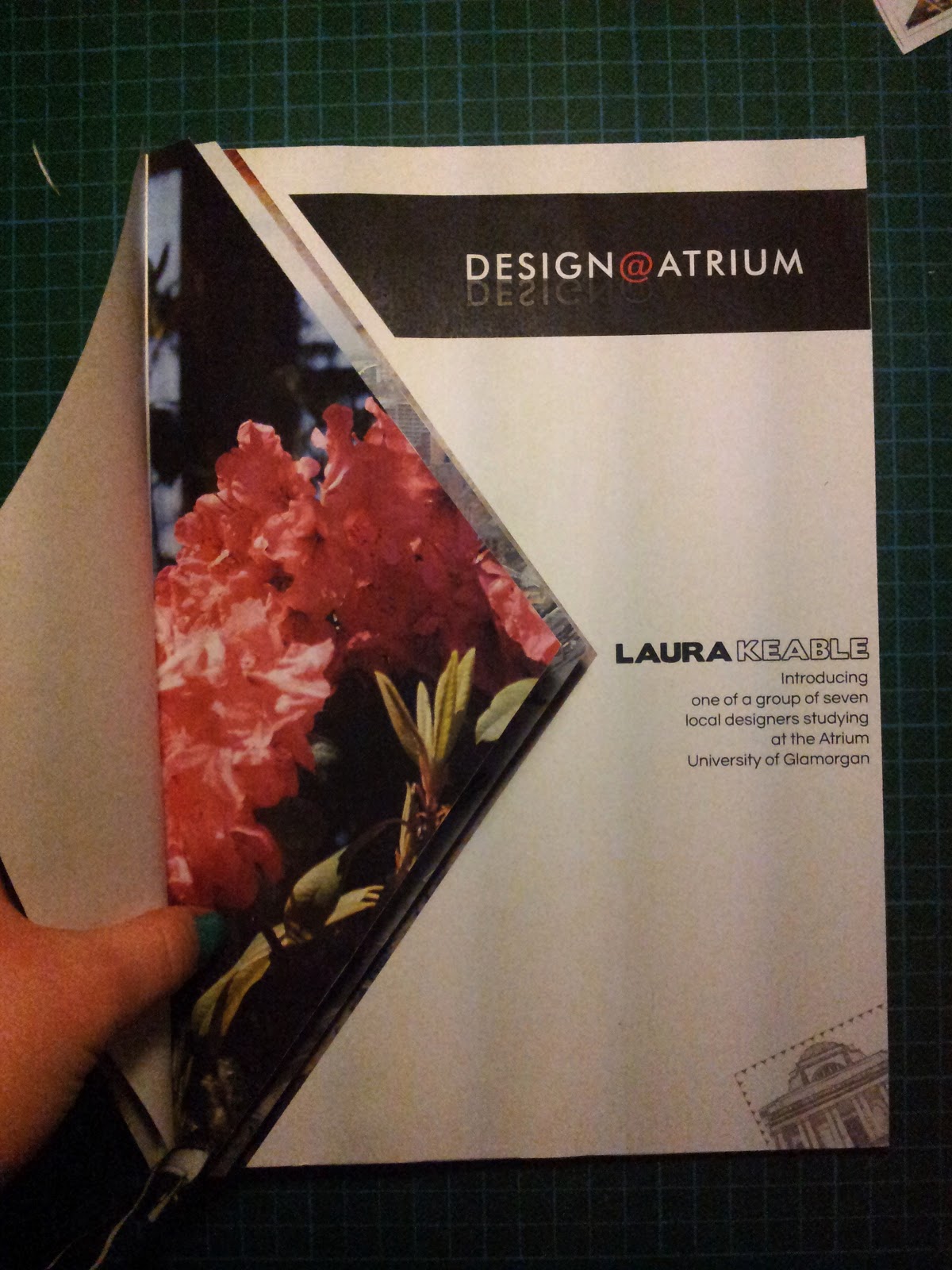
This is my cover! Something a bit different to what I would usually do but there is my normal twist as you can see below, on the physical copy you can open each triangle to reveal the photograph underneath. I chose each image for colour and texture so there are some from Cardiff, some from Spain and also one from Manchester. 

The illustration in the corner is the stamp/sticker idea we went with. We created a Twitter profile so people would be able to post pictures from their phones of the stickers when they see them around Cardiff. @Seren_Serif if you fancy a look!
Below is me making the physical copy of my magazine cover and also the final one. 


Really happy with how it turned out. Seems like people like flicking through the pictures so that's a nice touch!


Friday 15th: New brief.
Monday 18th: VISUAL DIARY DEADLINE! 


Tuesday, 12 February 2013

Magazine brief

We have been split up into groups, (numbers out of a hat job) and have been told to name our design studio. We have to create a cover for the new Design@Atrium magazine, and a double page spread between us advertising us as designers and our work. We have to bring the Welsh and English together as it is to be translated to be read by both - so this brought us to our design company name - Seren Serif. Seren being Welsh for star, and serif to do with typography seemed a good combination!

We have another new brief for Barry now that the Boyd Clack project is over - to design toilet door signs for an Asian style tapas bar in Cardiff called Double Super Happy. Cool project but no idea what to do yet!

Thursday, 7 February 2013

Packaging Project

Has finished! The crit is tomorrow morning. Here are a few photos I did using the light tent and the posh lights! 


I really like how it's turned out in the end! On each page there is a different hand generated pattern, and on the top there are Gill Sans' Gs.  The hot and cold colours strangely really work together and the textured effect of the paint looks good against the white of the top. 

Not so happy with the box for it - definately form follows function - but I tried to tie it together with the book more by adding patterns and colour to the tray and patterns to the side of the box. 

Fingers crossed about tomorrow!