Friday, 15 March 2013

Software and Flash Brief

Coursework 1 - 

Software Portfolio: 4 Separate tasks to test our software skills we have been developing over the year.
  1. Photoshop Hoax - using our Photoshop skills we have learnt create a hoax using at least two images.
  2. Illustrator Typeface - based on our typeface we started in our visual diaries, recreate at least 3 letterforms in Illustrator.
  3. InDesign - Create a multipage magazine spread based on our most recent essay. 
  4. Online Tutorial - Find and try an online tutorial that we think is essential for us to improve our software skills.
Deadline: 19/4/13


Flash brief: To create an interactive CV for ourselves using Flash containing About, Contact and Gallery pages. 

Deadline: 10/5/13


Visual Studies

As it's due on monday and I've been keeping up with it during the year I'm just finishing off bits and bobs with my visual diaries today, no major rush like I've found with my other deadlines.. I'll miss them after I've handed in on monday!

This diary, is possibly my fav of the 3, just full of cuttings from arty magazines!

We had to practise using grid paper to create a few letters of a new typeface.

Grungevetica! Messing with Helvetica to create something a bit different!

Wednesday, 13 March 2013

Tonnes of deadlines!

It's been such a manic week!

Friday 8th: 1800ish word essay on 6 lectures we had attended - Although I found this really hard, I ended up going over the word count once I got into it. I featured mine on Arts and Crafts, Art Nouveau, Pablo Picasso, The Bauhaus, Art Deco, and the Sixties.

Monday 11th: Live project hand in - we had to design funky toilet door signs for an Asian inspired tapas bar in Cardiff. Really not keen on what I handed in but I couldn't get the effect I wanted really.

Wednesday 13th: Main project - Designing a double page spread for a magazine in a group, and designing the cover as individuals. Here is our spread:


We put our work in frames, and went and hung them up in a fallen down tree in Bute Park! Think the image is powerful (needs a few tweaks but ran out of time as normal) Also the flap needs work. I found working in a group really hard becasue I felt at times my ideas and opinions weren't being taken into account, but we got there in the end. 


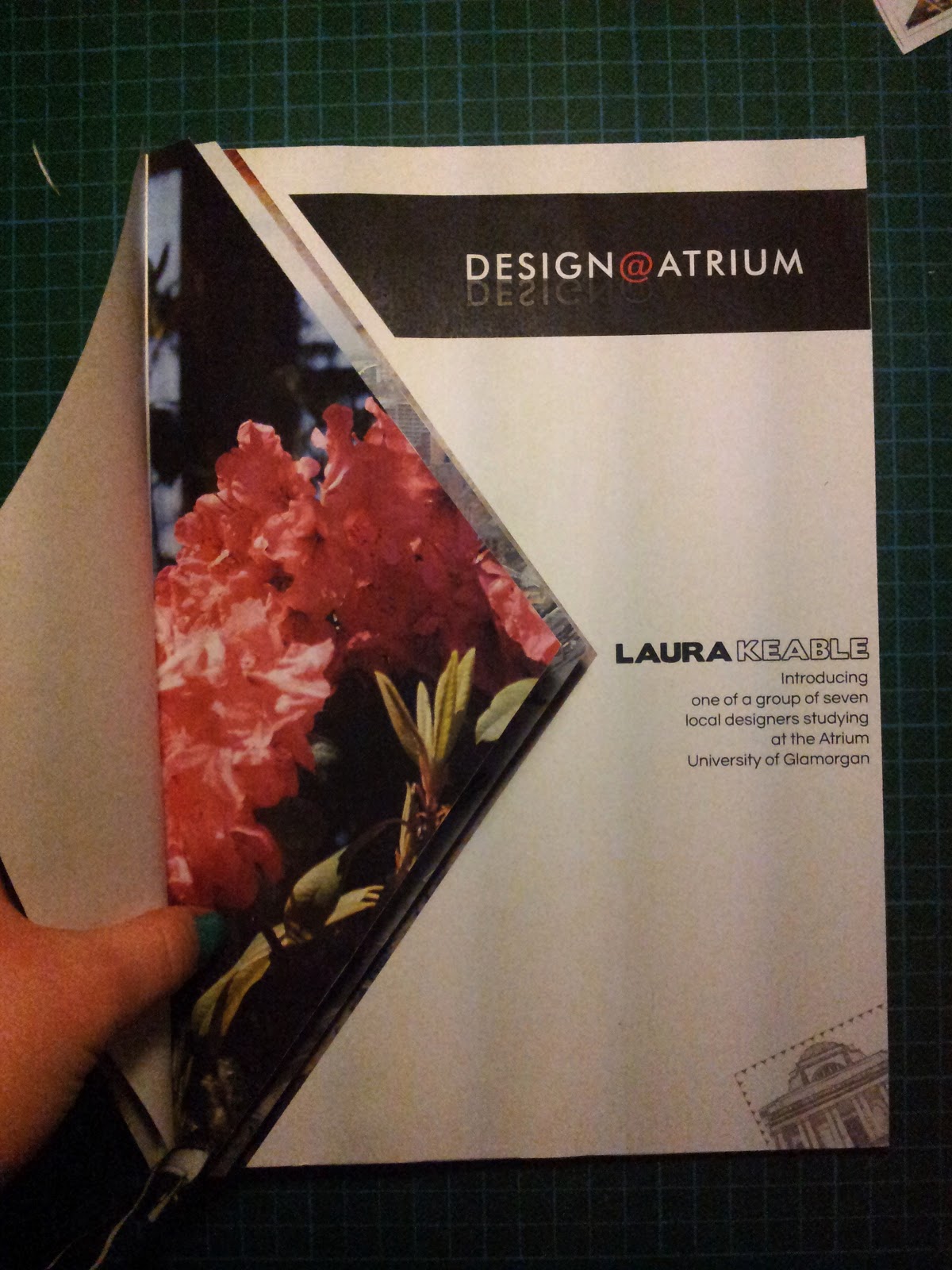
This is my cover! Something a bit different to what I would usually do but there is my normal twist as you can see below, on the physical copy you can open each triangle to reveal the photograph underneath. I chose each image for colour and texture so there are some from Cardiff, some from Spain and also one from Manchester. 

The illustration in the corner is the stamp/sticker idea we went with. We created a Twitter profile so people would be able to post pictures from their phones of the stickers when they see them around Cardiff. @Seren_Serif if you fancy a look!
Below is me making the physical copy of my magazine cover and also the final one. 


Really happy with how it turned out. Seems like people like flicking through the pictures so that's a nice touch!


Friday 15th: New brief.
Monday 18th: VISUAL DIARY DEADLINE! 


Tuesday, 12 February 2013

Magazine brief

We have been split up into groups, (numbers out of a hat job) and have been told to name our design studio. We have to create a cover for the new Design@Atrium magazine, and a double page spread between us advertising us as designers and our work. We have to bring the Welsh and English together as it is to be translated to be read by both - so this brought us to our design company name - Seren Serif. Seren being Welsh for star, and serif to do with typography seemed a good combination!

We have another new brief for Barry now that the Boyd Clack project is over - to design toilet door signs for an Asian style tapas bar in Cardiff called Double Super Happy. Cool project but no idea what to do yet!

Thursday, 7 February 2013

Packaging Project

Has finished! The crit is tomorrow morning. Here are a few photos I did using the light tent and the posh lights! 


I really like how it's turned out in the end! On each page there is a different hand generated pattern, and on the top there are Gill Sans' Gs.  The hot and cold colours strangely really work together and the textured effect of the paint looks good against the white of the top. 

Not so happy with the box for it - definately form follows function - but I tried to tie it together with the book more by adding patterns and colour to the tray and patterns to the side of the box. 

Fingers crossed about tomorrow!

Friday, 25 January 2013

Faces!

Little personal project. I decided to scan my face! I think i want to do more of this sort of thing and see what I can achieve, adding maybe glitter etc and probably getting myself into a right old mess!

Packaging project

A few pages from my sketchbook, from research into different kinds of packaging, through to ideas and idea development to planning out my final idea. I've decided to go for a book - as packaging for the data (the typeface will be stored on an SD card.) I think my idea is going well at the moment as I don't know of anyone else who has gone for a book. (I guess it's a bit touch and go as to whether it's actually packaging.)


 Although I've gone for a book, it won't be an ordinary book! My first plan was to make a book with a CD being held in it. But then I thought about this type of book, with folds. Experimenting with it, I found out that it works by fanning it out. I'm making this a statement (hopefully) by putting patterns on the top to see, and patterns inside on each page, with a little information on the type.


The deadline is in about 2 weeks now and in that time I need to:
Research patterns, work out where these patterns go, find the right paper to do the job, design the front and back covers, make a little pocket for the SD card, and make a small hinge or something to keep the book fanned out.